admissions open: +91 7591-915-445
The Story and Meaning Behind the ARTONE Logo
The ARTONE logo is more than a design — it is a visual philosophy born from both hand and heart, rooted in the belief that creativity and learning can liberate.
It began in 2012, when Mukt first sketched the symbol by hand — a quiet but powerful moment of inspiration. That sketch, drawn in just two colors — black and white, became the seed of what ARTONE stands for. Over time, a few dedicated collaborators helped transform it into a digital form, but the core stayed unchanged: a harmony of shapes, symbols, and story.
A Language of Symbols
The logo speaks through pure form — a square, a circle, and a bold sweep of movement. These are not decorative choices, but deep symbols:
The square represents structure, the frame of learning, and the world we are born into — sometimes safe, sometimes limiting.
The circle, placed above, is a universal symbol of wholeness, unity, and potential — it can be seen as the head of a person, the sun, or a goal on the horizon.
What ties it all together is the clever use of negative and positive space. With just black and white, the logo achieves contrast, depth, and multiple meanings — reflecting ARTONE’s belief in balance, duality, and the unseen possibilities within constraints.
Three Meanings.
One Spirit.
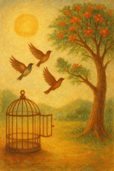
1. A Bird Breaking Free from the Box.
At one angle, the bold V-like shape becomes a bird bursting out of the square — wings lifted in flight. It symbolizes ARTONE’s mission: helping learners break free from limitations, and encouraging them to soar beyond convention, guided by their own creativity.
2. Two Birds Flying Toward a Goal
From another perspective, the shape reveals two birds in flight — moving together, with confidence, toward the circle: a sun, a dream, a destination.
This reminds us that creativity must be purposeful, and that with the right guidance — and the right companions — learners can go further than they ever imagined.
3. A Person Engaged in Learning
Seen another way, the form becomes a human figure — the circle as a head, the curved lines as an open book. This image reflects education in its purest form: a person immersed in learning, reading, and observing — lifted by knowledge, and rising through understanding.
The Philosophy in the Form
With only two colors — black and white — the logo harnesses the power of positive and negative space. What is missing becomes just as meaningful as what is seen. It invites viewers to look deeper — to find possibility where others see limitation.
In its simple geometry — a square and a circle — lies a balance between structure and freedom, grounding and aspiration, mind and spirit
In Essence...
The ARTONE logo is not just a mark. It is a manifesto in form.
It reflects a space where learners become free, focused, fearless — and most importantly, unstoppable— where the mind opens, the heart leads, and the spirit soars.
The 4 sides
This is the story of ARTONE — told in shape and space, silence and symbol.”
“Break the box.
Fly with purpose.
Read the world.
Create with heart.”
office address
Artone Institute Nalloornad. P O. Mananthavady. Wayanad. Kerala. India pin: 670-645
Admission: +91 6282 922 158
Office : +91 7591 915 445
© 2025. All rights reserved.
get-direction
home about us. Courses/classes
Student works. contact us Support us